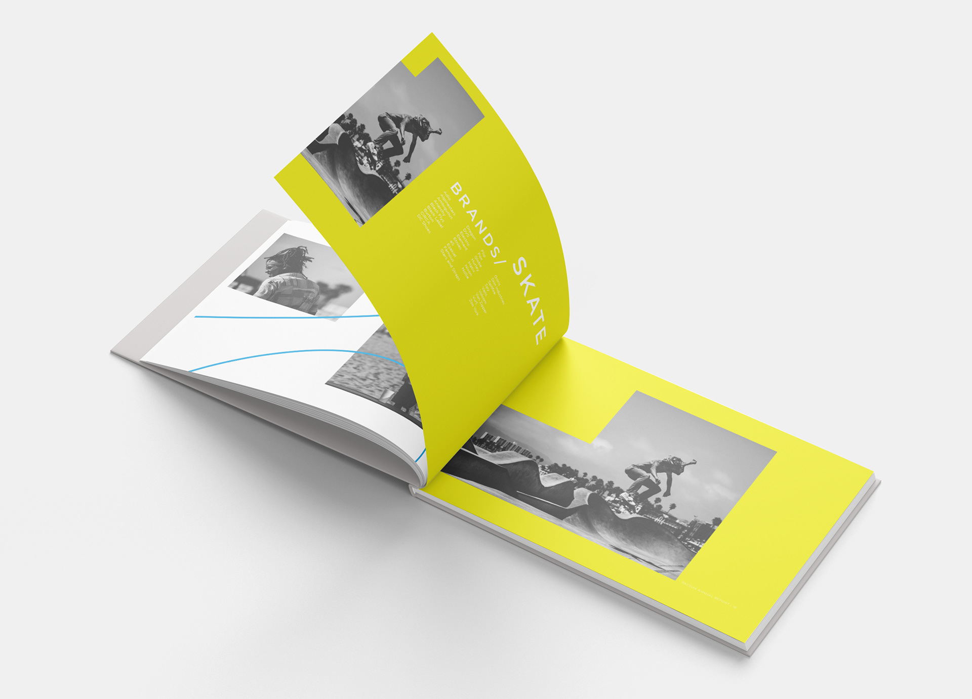
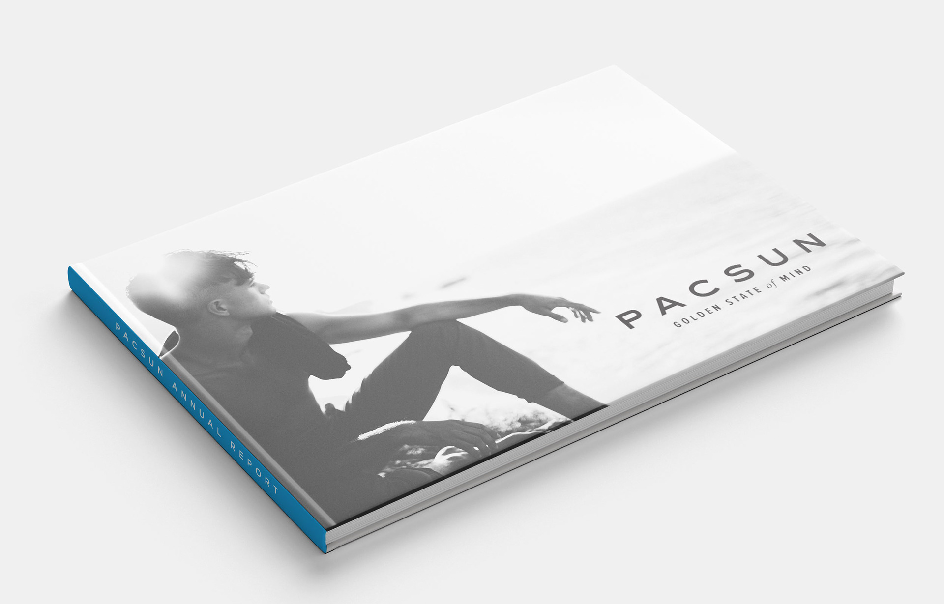
For this project we were to choose any company we want and design a corporate annual report. The goal of this project was to interpret your company’s corporate position and feel to create something unified. My company was Pacsun Sunwear of California Inc., this company is the perfect example of California lifestyle clothing. They keep up on the latest trends of fashion, skate, and surf. After viewing a handful of their annual reports I decided to go with something a little different then their typical designs. They usual focus on full bleed colored images and separate pages to hold text alone. I wanted to take the bright colors out of the images and use them as graphic elements while leaving the images black and white. The images and text appear together on spreads instead of separating like they’ve done in the past. I used all of my own images that I took while in California so I could easily manipulate each photo to have a unified look throughout. The paper stock I used was mohawk gloss text 70 lb and the font I chose was Gotham at varied weights because thats the closest font I could get to match the one used in their newest logo.

Spring 2018 | Publication Design | Francis Demaske