
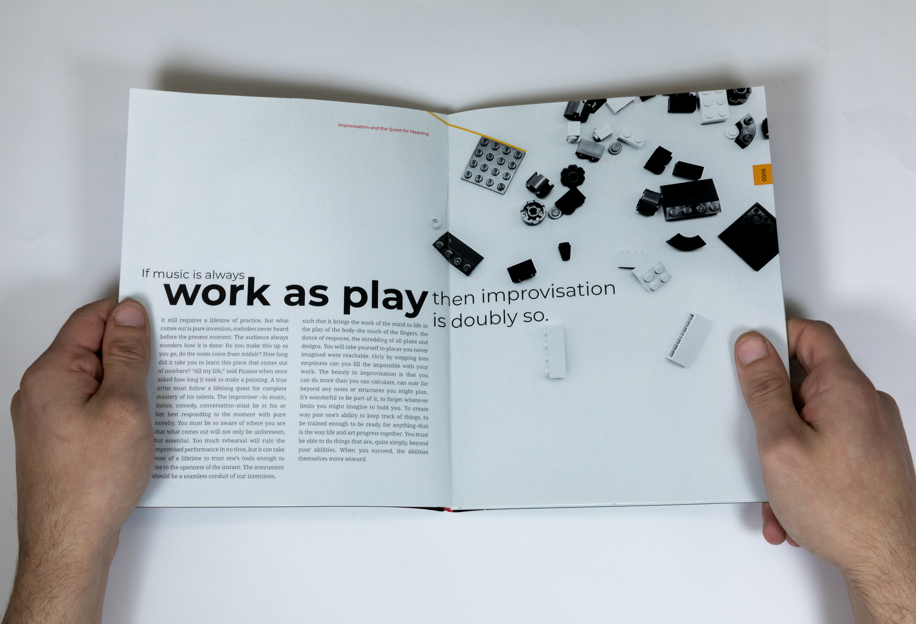
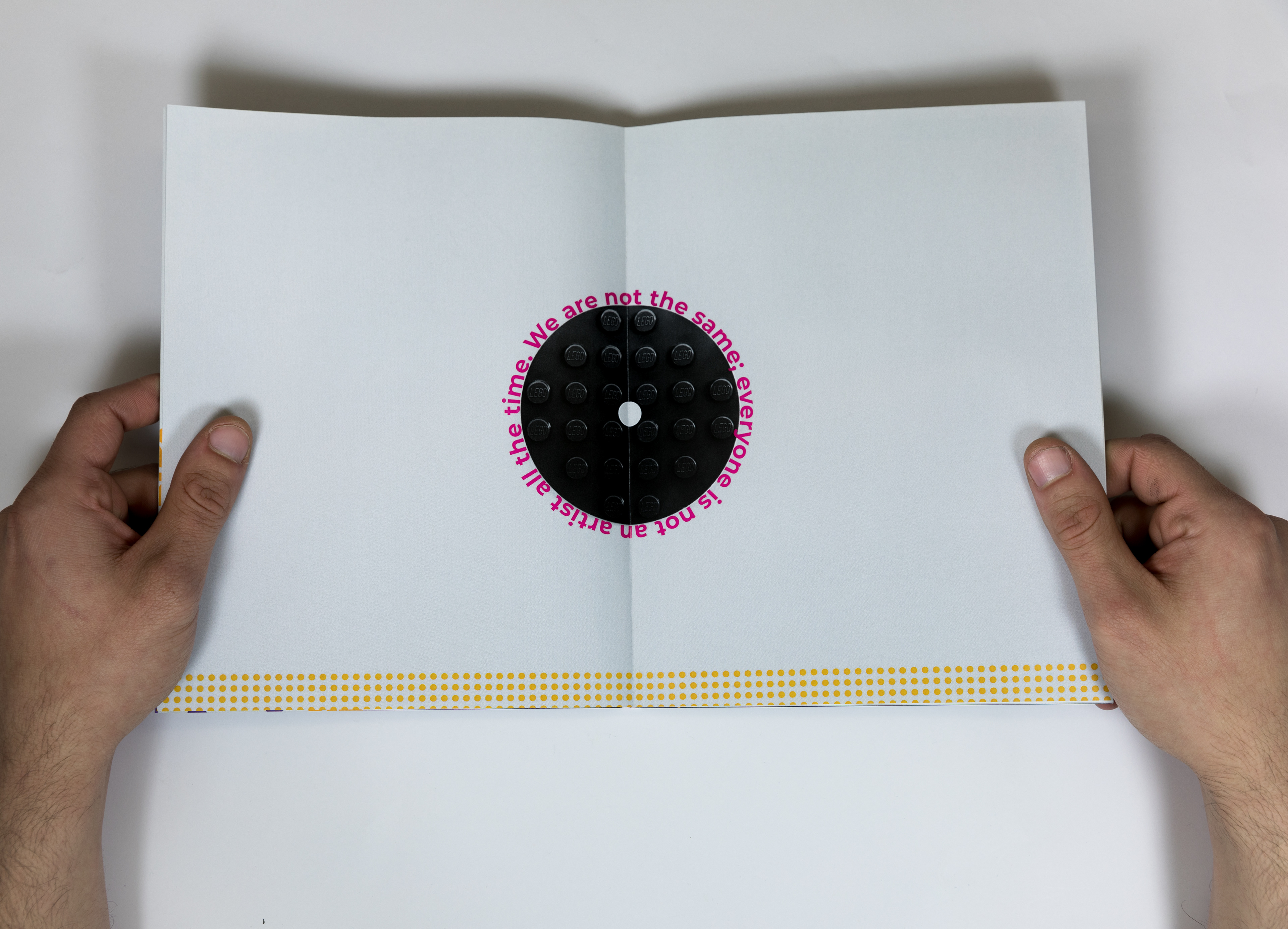
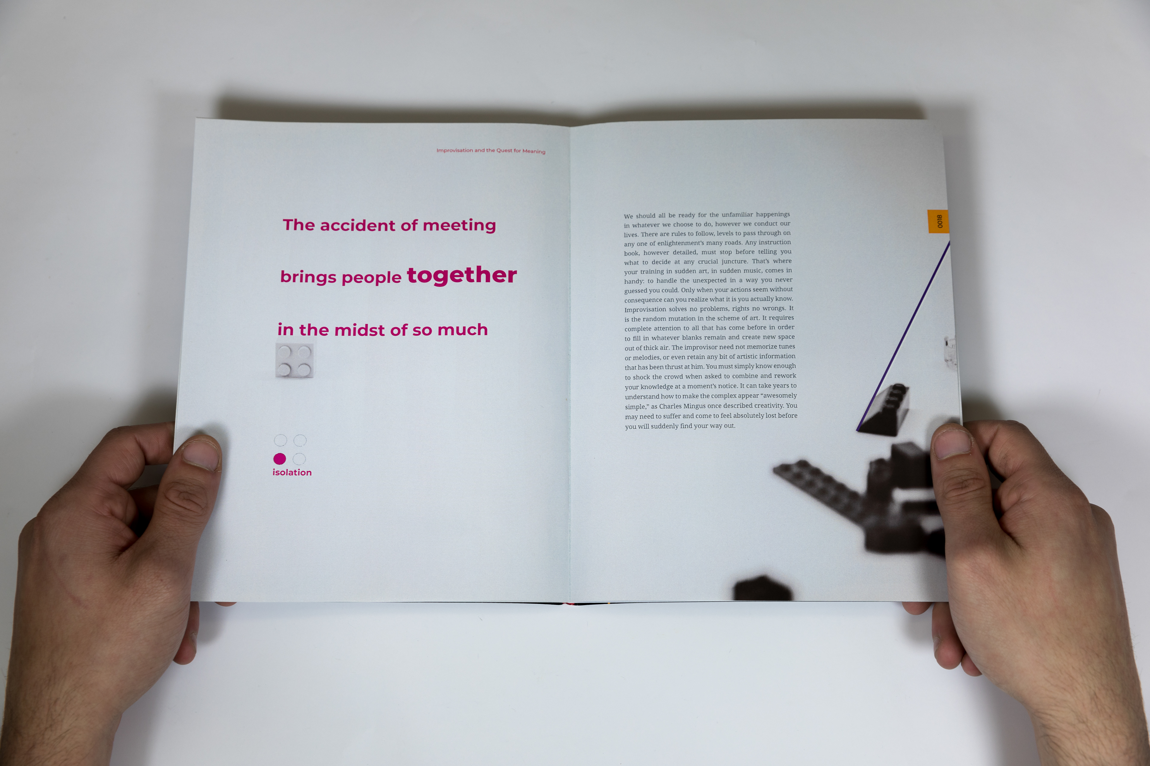
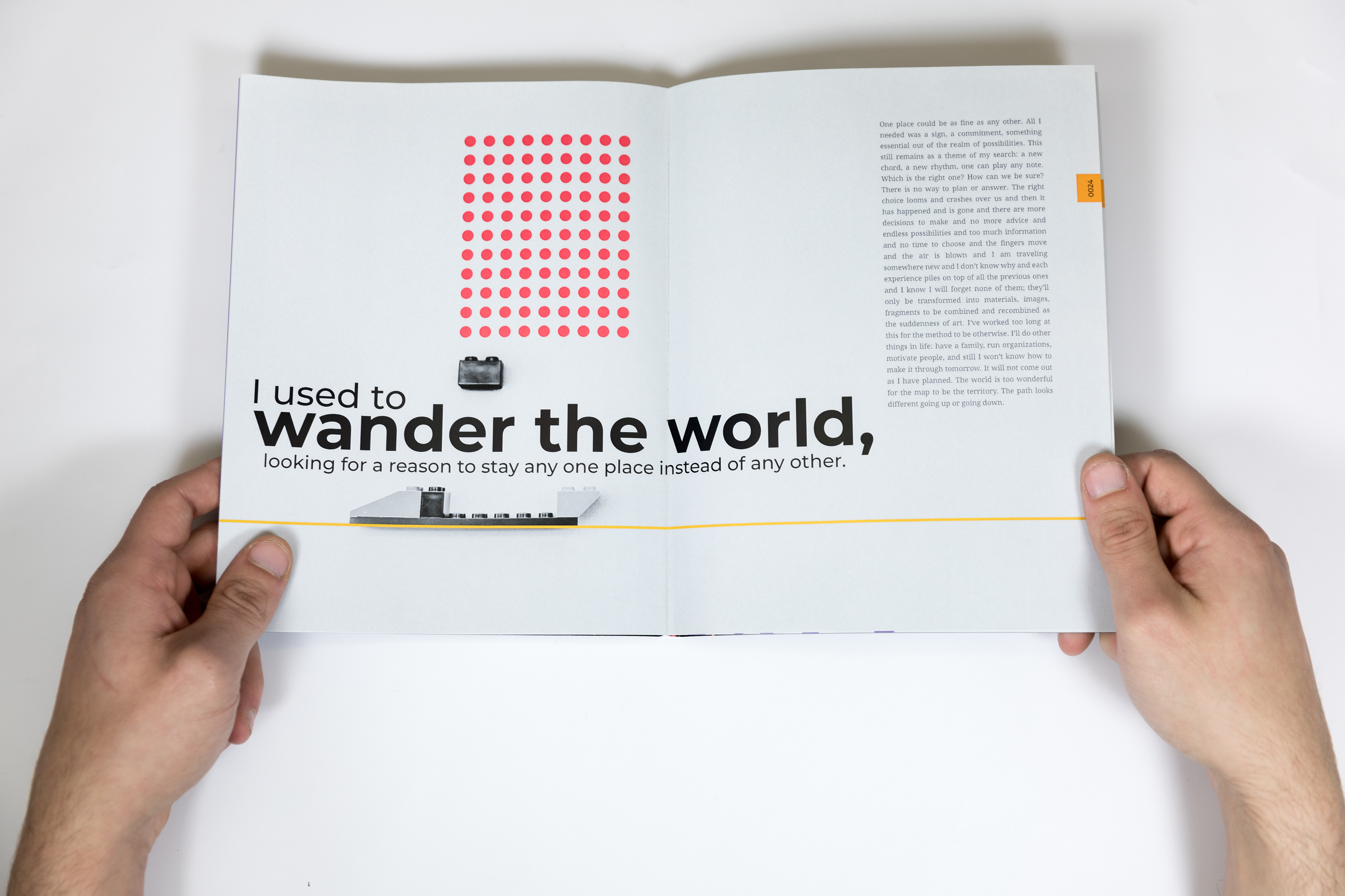
For this project we were to choose an object and it will be used as the basis of all the visual material. The text was provided to us and was an essay titled Spontaneous Effort by David Rothenberg. The goals for this project was to create relationships between your images, text and content. My object was legos and I decided to go a different route with it. Instead of using the basic primary colors that legos are I took black and white images and used a brighter and more saturated color palette for the graphic elements. The graphic elements consist of lines and circles, these graphics referring to the straight edges on legos and also the circular connection pieces of each lego. Between the images and graphics I wanted each spread to create point elements to lead the reader to the text blocks or to accent the images. For the text blocks I used Droid Serif and for headings I used Montserrat at varying weights. The combination of the serif and the sans-serif complemented each other and also created variation in the text.


Spring 2018 | Publication Design | Francis Demaske